How to design UX portfolio
In UX industry it's your portfolio that'll do the talking for you rather than CV and certificates. Here are a few tips on how to design one that's informative and relevant – all to boost your career prospects.
Target your portfolio for each role
There's nothing worse than a UX designer's portfolio that's got a ton of UI mockups and no user research or usability testing reports. Try to make it relevant to the role you're applying for:
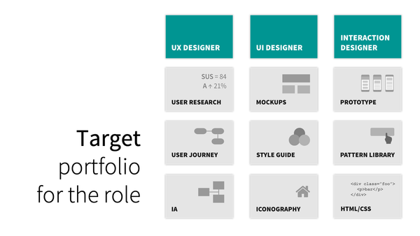
If it's for a UI designer's role, you ideally want to include a design system (including a style guide and a pattern library) additionally to a usual set of user interface wireframes.
Showcase each step of the design process
You could use a design process as a foundation for your storytelling. This way you will be able to showcase your skills in different areas of your role as a user experience designer.
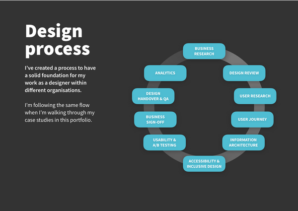
Try to write a few paragraphs about your contribution for each of these steps of the project: business research → design review → user research → user journey → information architecture → accessibility & inclusive design → usability & A/B testing → business sign-off → design handover & QA → analytics
Explain why
It's quite typical to present a set of design deliverables in a portfolio, but very few designers actually explain why they've created these and what's the value behind each output for your team and for your company's business.
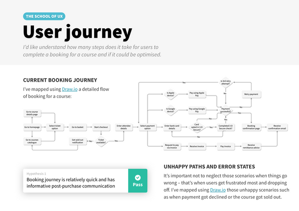
Try not only listing what you've done but why you've done it, e.g. I've mapped a user journey in order to understand how many steps does it take for users of our company's website to complete a booking, analyse where the most drop-offs happen, and how the journey could be optimised to improve conversion rates.
Support your design decisions with facts
Make sure you include user feedback from usability tests with proofs of your assumptions, supporting various design decisions you've made throughout the project.
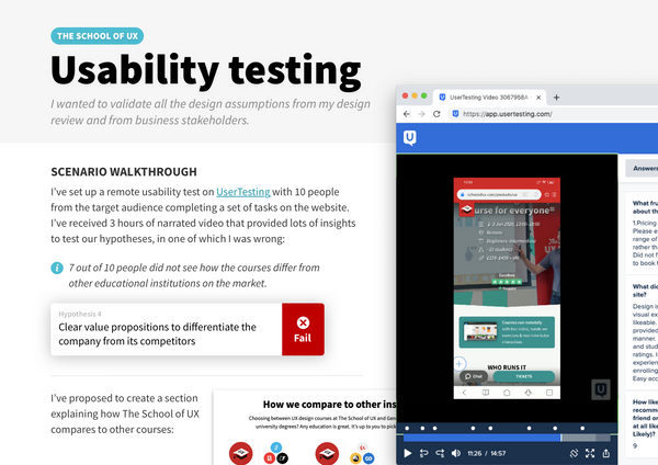
Facts-based design approach goes a long way, compared to creating something based on just having a gut feeling.
